
If you want to navigate confidently under VFR, knowing how to read a sectional chart is non-negotiable. Every airport symbol, airspace boundary, terrain contour, and navaid on that chart is there to keep you safe and legal — but only if you can decode what you’re looking at. The good news is that sectional charts follow a consistent, learnable system. Once you understand the building blocks, the chart starts to tell you exactly what you need to know.
This guide walks through every major element of a VFR sectional chart — from airport data blocks and airspace boundaries to terrain contours and navigation fixes — so you can read any sectional with confidence.
What Is a VFR Sectional Chart?

A VFR sectional aeronautical chart is a 1:500,000 scale topographic map designed specifically for visual navigation in aircraft. The FAA publishes sectional charts on a 56-day update cycle, and they cover every region of the continental United States. Each chart section overlaps its neighbors slightly, so you can plan cross-country flights across multiple charts without losing continuity.
Specifically, the chart gets its name from the fact that the contiguous US is divided into 37 sections — each one a separate chart. Together, these sections cover every airport, airspace boundary, terrain feature, and navigation facility in the country. Additionally, sectional charts include a detailed legend along the bottom edge, which you should reference until the symbols become second nature.
You can purchase paper sectionals at your local FBO or aviation supply store. Alternatively, free digital versions are available at SkyVector.com, and every major EFB app — ForeFlight, Garmin Pilot, FlyQ — includes current sectional overlays updated automatically every cycle.
How to Read a Sectional Chart: Airport Symbols and Data Blocks
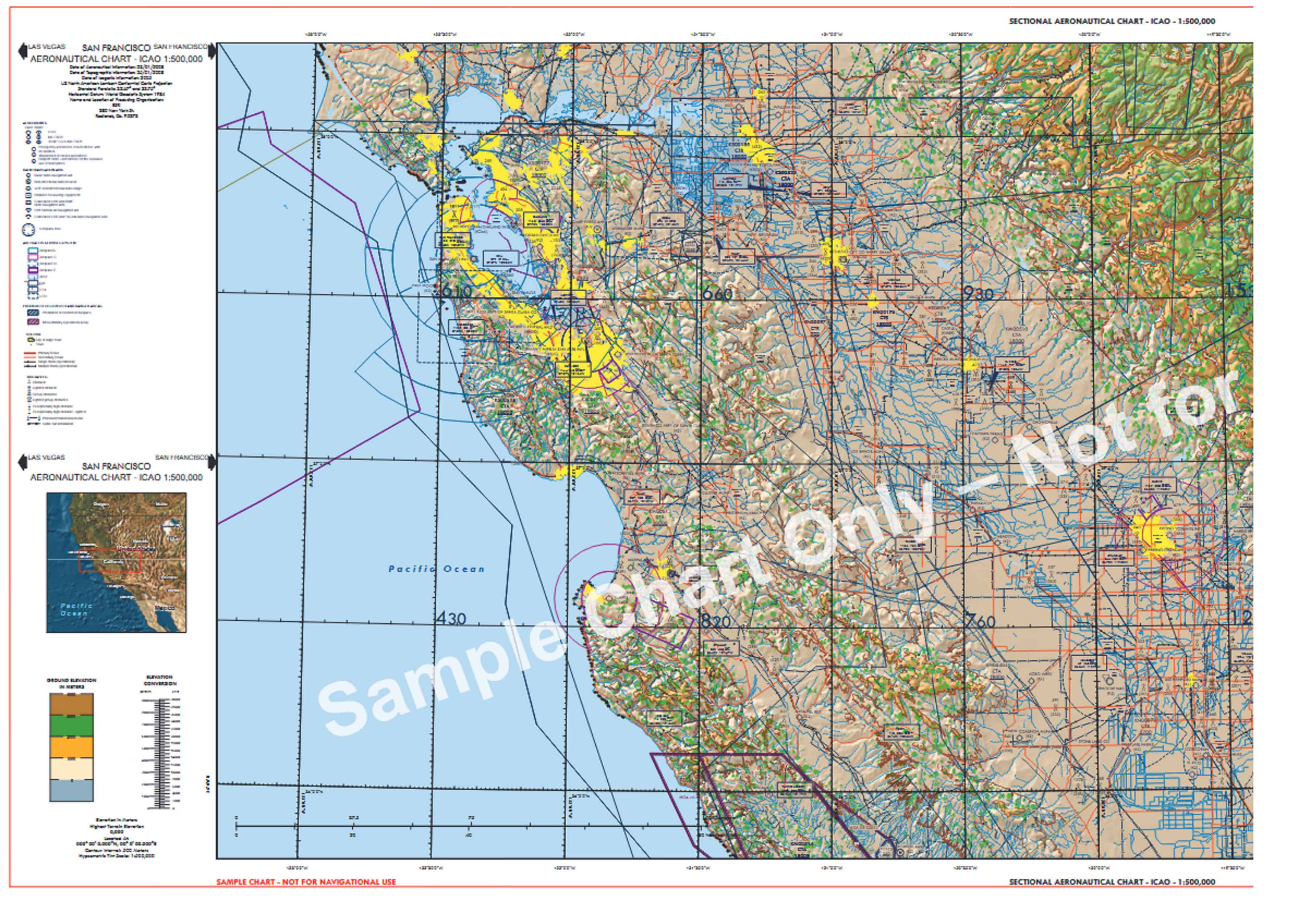
Airports are the most important symbols on a sectional chart, and each one carries a data block that tells you critical operational information. Understanding this data block is fundamental to reading any sectional chart correctly.
The shape and color of the airport symbol indicates the airport type at a glance. Hard-surface runways longer than 1,500 feet show as a circle with spokes (tick marks); soft-surface airports use an open circle. Controlled airports with an operating control tower are depicted in blue. Uncontrolled airports appear in magenta. A runway layout symbol replaces the simple circle for airports with runways over 8,069 feet.
The airport data block appears adjacent to the symbol and contains the following information in a standard sequence:
| Data Block Element | What It Tells You | Example |
|---|---|---|
| Airport Name | Official FAA name | FALCON FLD |
| CT – Frequency | Control tower frequency (if controlled) | CT-119.9 |
| ATIS Frequency | Automated weather broadcast | ATIS 132.75 |
| Field Elevation | MSL elevation of highest runway point | 1394 |
| Lighting Code | Runway lighting availability | L (pilot-controlled or dusk-to-dawn) |
| Longest Runway | Length of longest runway in hundreds of feet | 100 = 10,000 ft |
| UNICOM Frequency | Common traffic advisory (uncontrolled) | 122.8 |
Additionally, a star symbol next to the airport name indicates a rotating beacon is operated from sunset to sunrise. An “R” indicates a non-standard beacon pattern. For instrument approaches, an underline beneath the airport name confirms instrument approach procedures are published.
Airspace Boundaries: What the Colors and Lines Mean

Airspace is where many pilots struggle with sectional charts, but the color-coding system is logical once you know the key. Each class of airspace has a specific visual signature.
Class B airspace appears as solid blue lines forming concentric circles centered on major hub airports. The numbers inside each ring show the top and bottom altitudes of that segment in hundreds of feet MSL (e.g., 80/30 means 8,000 feet MSL top, 3,000 feet MSL floor).
Class C airspace uses solid magenta circles, typically two rings, around approach-controlled airports. Consequently, if you see solid magenta concentric rings, you’re looking at an airport with radar approach control and a 5 nm / 10 nm ring structure.
Class D airspace is depicted with a dashed blue circle around towered airports that don’t qualify for Class C or B. The dashed blue boundary extends from the surface to an altitude shown in a box on the chart (e.g., [27] = 2,700 feet MSL).
Class E surface extensions appear as dashed magenta lines extending outward from certain airports — typically those with instrument approaches but no operating tower. These designate Class E airspace starting at the surface, which matters for VFR cloud clearance requirements. In contrast, a solid magenta line marks the boundary where Class E transitions from 700 feet AGL to 1,200 feet AGL above the surface.
Special use airspace — prohibited, restricted, warning, military operations areas (MOAs), and alert areas — appears with distinct boundaries and alphanumeric identifiers. Furthermore, MOAs appear in magenta hatching with the MOA name and hours of use printed alongside. Always check NOTAMs before transiting any special use airspace.
Terrain, Elevation, and Obstacles on Your Sectional Chart
Terrain awareness starts with understanding how your sectional chart communicates elevation data. Two key tools work together: contour lines and Maximum Elevation Figures (MEFs).
Contour lines connect points of equal elevation across the terrain. On a sectional, contour intervals are typically 500 feet, with a supplemental 250-foot interval for gentler terrain. The color shading between contours shifts from green (low elevation) through tan and brown to dark brown and gray (high terrain). Therefore, the color density of a chart section gives you an immediate visual sense of how mountainous the area is.
Maximum Elevation Figures (MEFs) appear in large bold numbers within each quadrant of the chart, divided by latitude and longitude lines. The MEF represents the highest terrain or obstacle within that quadrant, rounded up to the next 100 feet above the highest feature. Specifically, MEFs are based on terrain plus an obstacle clearance buffer — so flying at or above the MEF puts you clear of everything in that quadrant, though ATC separation and IFR minimums are separate considerations entirely.
Obstacle symbols mark towers, smokestacks, and other man-made hazards above 200 feet AGL. A small tower symbol with a number shows the obstacle’s MSL elevation, with the AGL height in parentheses below. High-intensity obstruction lights appear as a flash symbol. Additionally, transmission line symbols mark power lines crossing terrain — particularly important for low-level operations near ridges and valleys.
How to Read Sectional Chart Navaids and Navigation Fixes

Navigation aids on the sectional chart give you the ground-based reference points for position fixing, airways, and instrument approaches. Even GPS-equipped cockpits benefit from understanding navaid symbology — many IFR procedures still rely on VOR and DME.
A VOR station appears as a hexagonal compass rose symbol with a dot at the center. The station name, three-letter identifier, and frequency are printed alongside. A VOR/DME station uses the same symbol with a small circle added inside the hexagon. VORTAC stations — co-located VOR and TACAN — display the same basic symbol with additional notation. Nearby victor airways radiate outward from the VOR compass rose, printed in blue as “V” followed by the airway number.
NDB stations appear as a small open circle with a dot. The station name, frequency, and Morse code identifier print adjacent to the symbol. NDBs are less common than they once were, as many have been decommissioned, but they still appear on charts where active.
Intersections and waypoints appear as small triangles with the five-letter name printed nearby. These fixes are used to define airway boundaries, holding patterns, and approach procedure entry points. Additionally, they give VFR pilots named position references for radar traffic advisories and flight following.
How to Read a Sectional Chart in the Digital Age

Digital EFB apps have transformed how most pilots interact with sectional charts. ForeFlight, Garmin Pilot, and FlyQ all overlay current FAA sectional data on a moving-map GPS display — updated automatically every 56-day chart cycle. Understanding how to read a sectional chart on these platforms is largely the same as paper; the symbology is identical.
That said, there are important practical differences. Digital sectionals update automatically, so you’re always on the current chart. Moreover, EFB apps let you tap any symbol to get airport information, airspace altitudes, and NOTAMs instantly. Weather overlays, TFR boundaries, and traffic can be added on top of the sectional layer. Consequently, the digital sectional is genuinely more situationally useful than paper for most flights.
However, paper sectional proficiency still matters. Electronic devices fail, batteries die, and suction cup mounts let go at the worst possible moment. Therefore, every pilot should be comfortable navigating with a paper sectional and be capable of folding it to the relevant area before departure. The FAA still tests sectional chart reading on the private pilot written exam for precisely this reason.
The best approach is to use digital tools for primary navigation while keeping a paper sectional as your backup. Ultimately, the pilots who know their charts cold — symbols, airspace, terrain, navaids — are the pilots who stay ahead of the airplane no matter what the avionics are doing.
Ready to Fly Smarter?
E3 Aviation Association connects pilots with the expert content, community, and tools to build real confidence and skill. Whether you’re sharpening your chart-reading or planning your next cross-country adventure, E3 has you covered. Join E3 Aviation Association today.
